Blender

Identify and address challenges users face when using the 3D modeling software Blender 3.0, focusing on users with varying experience levels.
Objective
The project resulted in a redesigned feedback and error message system for Blender 3.0, addressing key usability issues identified through quantitative user research.
Result
UX/UI designer- Including research, data analysis, ideation, prototyping.
My role
Scope
October - November 2022
Design process
Research

Understanding and defining the problems through literature reviews, user research.
Analysis

Qualitative data analysis of user data to design decisions.
Prototyping

Exploring different design solutions and creating prototypes in an iterative process.
01/Understanding the problem
Does the problem exist?
In the dynamic landscape of 3D modeling, complexity isn't just a technical hurdle — it's a roadblock that can deter aspiring creators and innovators. From designing architectural marvels to revolutionizing healthcare, open-source 3D tools like Blender hold immense potential. However, as noted by many community users, their intricate interfaces and steep learning curves create formidable barriers. Addressing these challenges isn't solely about improving software; it's about empowering a diverse community of users to unleash their creative vision and drive transformative change.
Blender users often express frustration in regard to the UI and how it creates a learning barrier.
Research & survey design
In order to improve the UI in to decrease frustraitions and better tailor to a diverse sett of users, including new users a quantitative study design was implemented. The quantitative research aimed to identify the exact portion of users struggeling with the existing UI as well as what aspects of the current UI is responsible for the most frustration.
In order to answer these questions a quantitative survey was constructed and distributed to different blender community plattforms. This sampeling method was non-probabilistic but targeted users with different experience levels by targeting community plattforms/groups advertising varying levels of expertise.
Research Objectives
Identify what quantity of blender users are struggling with the UI.
Determine which aspects of the UI contribute to the most frustration.
Obtain insights from users with varying experience levels.
Quantitative data analysis
The data from the survey and future workshop underwent a thematic analysis, which was conducted iteratively. Initially, all data were individually coded, followed by a collaborative review and re-evaluation of the resulting codes. The finalized codes were then grouped into distinct themes. This thematization process was carried out collaboratively using Miro.
.
It all begins with an idea. Maybe you want to launch a business. Maybe you want to turn a hobby into something more. Or maybe you have a creative project to share with the world. Whatever it is, the way you tell your story online can make all the difference.
Overall research conclusion
Common pain points include lack of time, motivation, planning ability, and distractions. While the current market offers some solutions, none provide the right balance of motivation and flexibility for diverse households.
02/Finding a solution
Ideation & sketching
To address the problems identified during the user research, brainstorming was used to explore various ideas and solutions, including smart mirrors, clocks, and mobile apps. Ultimately, an app-based solution was chosen for its flexibility and widespread accessibility.
Thereafter, the ideation process continued with sketches focusing on mobile solutions. The proposed final solution included a planning and scheduling system designed to help users manage daily chores efficiently. Additionally, It incorporated features for task sharing and breakdown, aimed at enhancing efficiency and alleviating task overload. Additionally, a reward system offering both social motivation and tangible rewards was integrated into the design to boost motivation and minimize distractions. This implementation aimed to make chore management not only more organized but also more enjoyable and engaging.
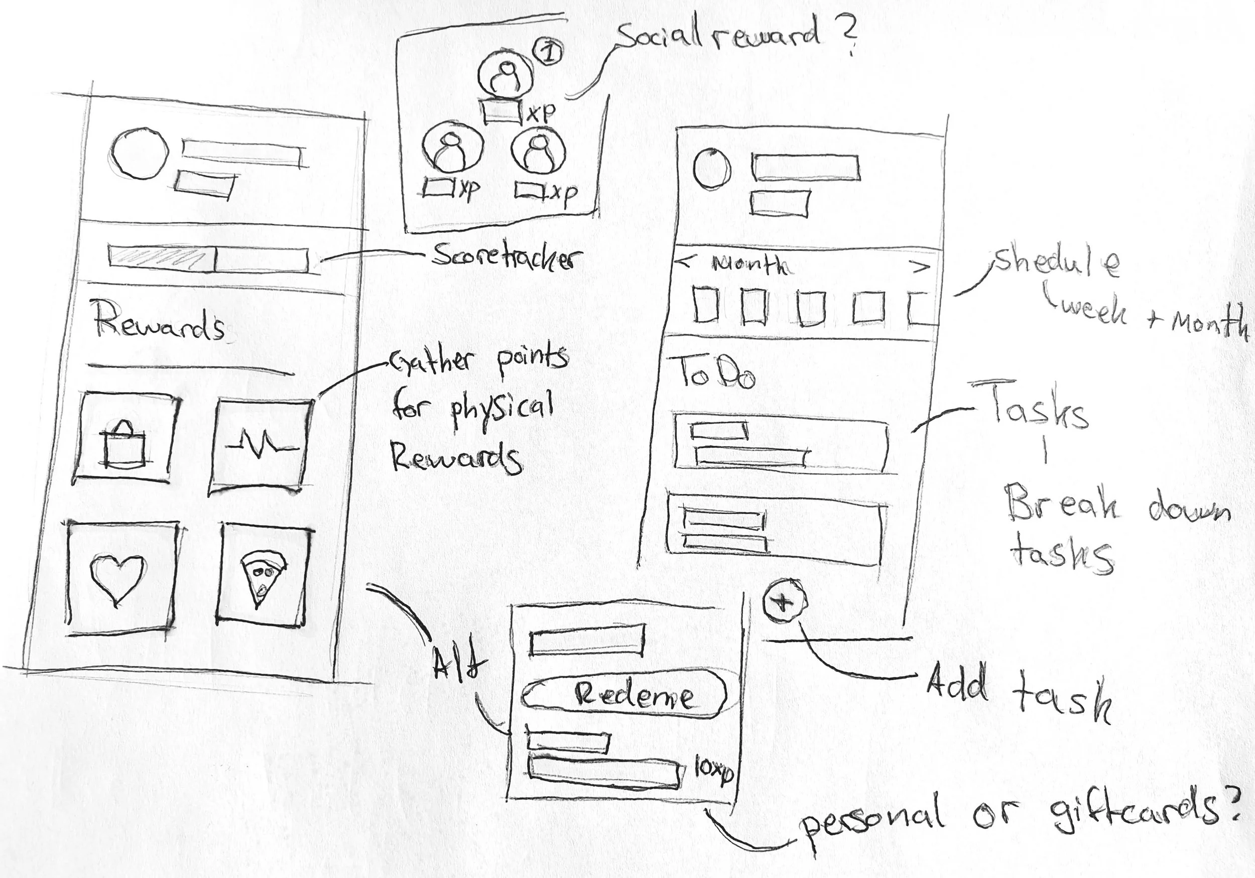
Wireframes
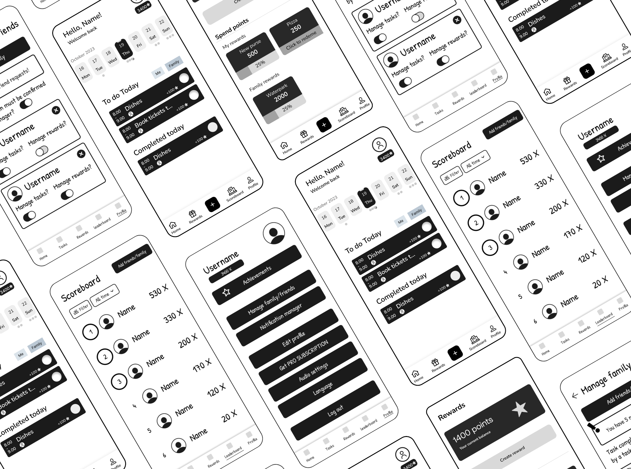
Based on the new insights gained from the user review, the design was updated and revitalized as digital wireframes.
When designing the wireframes focus was placed on understanding the information architecture and establishing user flows.
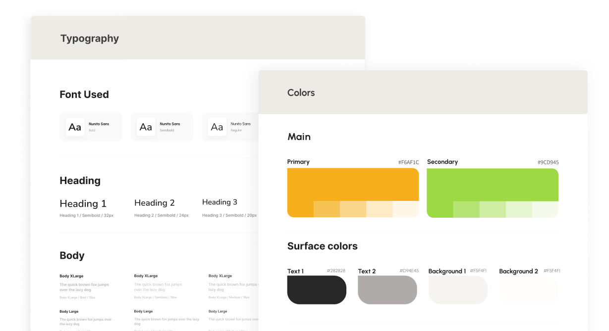
Graphic design & style
In order to ensure visual consistency and effective visual communication, a graphic profile was created. The color palette was selected to evoke a happy and friendly feeling to make the users feel more motivated. Additionally, the border radius was increased to give a soft and friendly impression. This design decision was made to align with the overall aesthetic and contribute to the welcoming feel of the interface.
Nunito Sans was chosen as the primary font due to its soft impression and high readability and suitability for mobile interfaces. The font sizes were carefully selected to prioritize readability and facilitate a clear visual hierarchy, ensuring users can easily navigate and understand the content.
finalizing the design
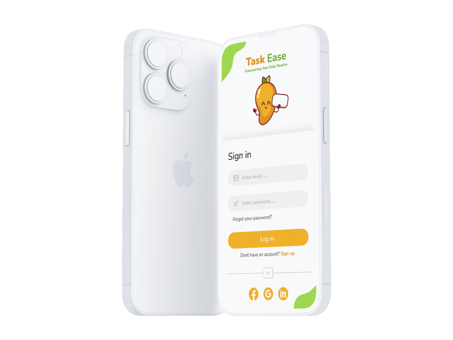
After having created the graphic design & style guide, the final prototype was created. During the creation additional considerations for placement and coloring of elements were taken into account. Additionally the prototype was given interactive elements using Figma.
Key app features
Allow users to plan and organize chores.
Allow users to break down tasks and/or split with other household members to increase time efficiency and make tasks appear less overwhelming.
Dual motivation system with physical custom rewards and a social ranking that is flexible for both single households and families.
Summative testing
In order to do a final evaluation of the interactive prototype and its endpoint performance, user tests were carried out with 5 users. Prior to the tests a set of benchmark goals were defined to evaluate the current status. Below are some of the key test goals that were studied as well as the test outcome of each goal. Overall the test was successful meeting all the predefined goals.
Key test goals
100 % task completion rate.
80 % of the participants should perceive the application as easy to use.
80% of the participants should express interest in using the application.
Test outcome
100% of the participants were able to complete the tasks.
100 % of the participants perceived the application as easy to use.
80% of the participants expressed interest in using the application.
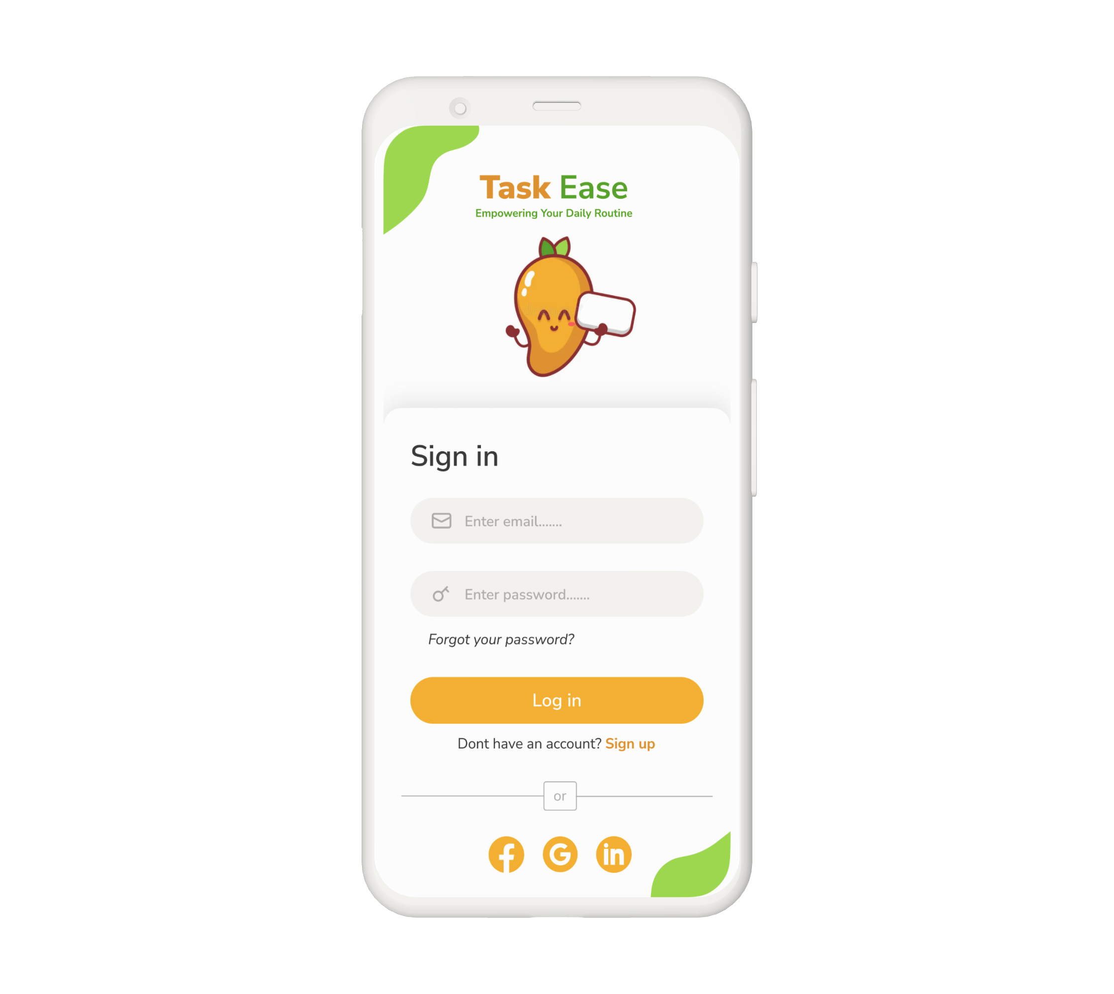
Sign in page
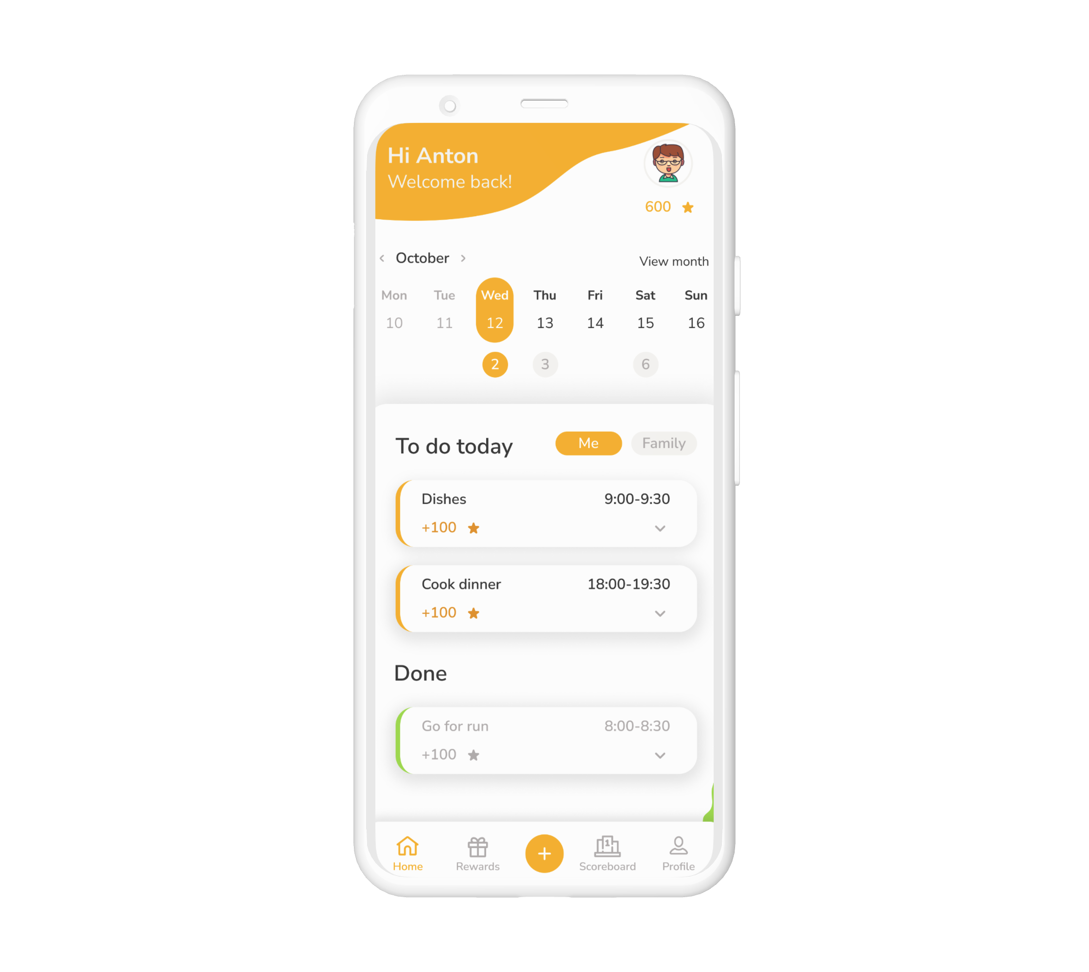
Schedule and task overview

Personal and shared custom rewards
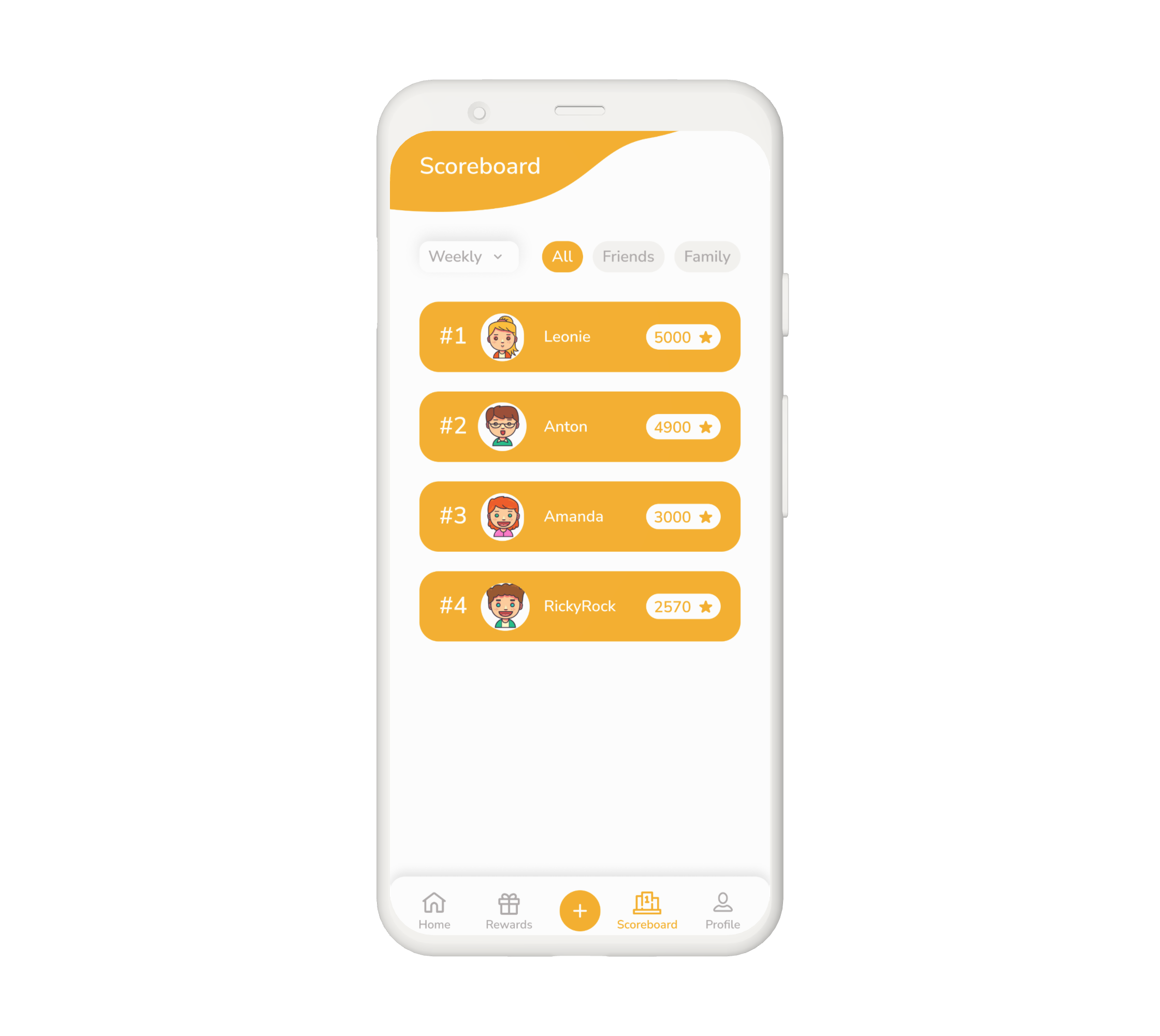
Score board for family and friends